Technologies of Romance: on the choice of a typeface for a book and the possibilities for technological Romance
Article DOI: https://dx.doi.org/10.15180/191211
Abstract
This paper offers a rationale for the typefaces chosen for the publication Technologies of Romance: Part II written by Paul O’Kane and celebrated at a symposium held at the Science Museum in November 2018. In setting out this rationale the paper broadens its considerations to reflect on the extent to which typefaces might in themselves usefully be considered as technologies of Romance.
It locates the practice of noting in print the typeface used in a given publication both historically and within contemporary practice. The recording of the decisions informing the making of a book starts to hint at the nature of the book itself as a technology, and allows for some discussion of the values of ‘making’ books within both past and present contexts of production, including the challenge of digital readers.
Elaboration on the decisions concerning the use of a given typeface for a publication then opens out a discussion of the intention behind selection, and both the functional and emotional ambitions of the typeface choice. The associative aims informing selection of a typeface are explored against an understanding of the associative embedding of meaning within aspects of the terminology of typefaces, as well as the scripts they represent and their designed forms. The paper explores for example the imperial associations embedded in the character shapes of the basic letterforms, as well as the technological implications of the terms such as uppercase and lowercase and the problematic colonial implications of the term ‘Latin’ to describe the script in question.
In considering the archival possibilities of typefaces as technologies the paper concludes by reflecting on examples of digital typeface design practice, which have actively sought to re-imagine a previous era of letterpress typesetting technology and the possibilities for investigating ongoing Romantic ideals within this very particular and highly specialised design discipline.
Keywords
book, design, font, making, publishing, romance, Technology, typeface
Introduction
https://dx.doi.org/10.15180/An author may jubilantly celebrate publication of ‘their’ book but a book is rarely the outcome of an individual’s efforts. The finessing of a manuscript requires the skilled services of editors and proof-readers. The translation of a manuscript to a visually ordered sequence of pages relies upon the skilled practices of a designer or a typographer perhaps working with a typesetter. The final articulation of content and format is resolved into the physical object of a book or, in the case of mainstream publishing, several thousand books, by, at the very least, a production manager, a printer and a binder. For the book to reach its intended audience a distribution and retail network are also important.
There are then many stakeholders and different stakeholder decisions that go into the making of a book, both in terms of content and final physical outcome, for example, the choice of narrative structure, the choice of cover design, the choice of binding method, the choice of pricing model. This paper is concerned with one such decision, the choice of typeface in which the book is typeset. More particularly it is concerned with the significance of the choice of typeface in relation to a book’s content, and quite specifically to the second volume in Paul O’Kane’s Technologies of Romance series of publications (O’Kane, 2018).[1] As the designer it was my task to reflect on the extent to which the typefaces chosen in the typesetting of the manuscript might usefully illustrate aspects of the ideas being explored within the book itself. To what extent might typefaces in themselves usefully be considered as technologies of Romance?
A decision worthy of note
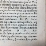
https://dx.doi.org/10.15180/191211/002Some books tell you the typeface that they are typeset in. Sometimes at the front on the imprint or colophon page of the book. This is traditionally the title page verso (p iv, also variously called the copyright or biblio page) and contains the essential printing and publication history of the work.[2] Here amongst the copyright and cataloguing information, a publisher may choose to include details of the design and production of the book, including the name and size of the typeface used and the name and location of one of the now fast-disappearing trade typesetting firms.
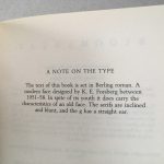
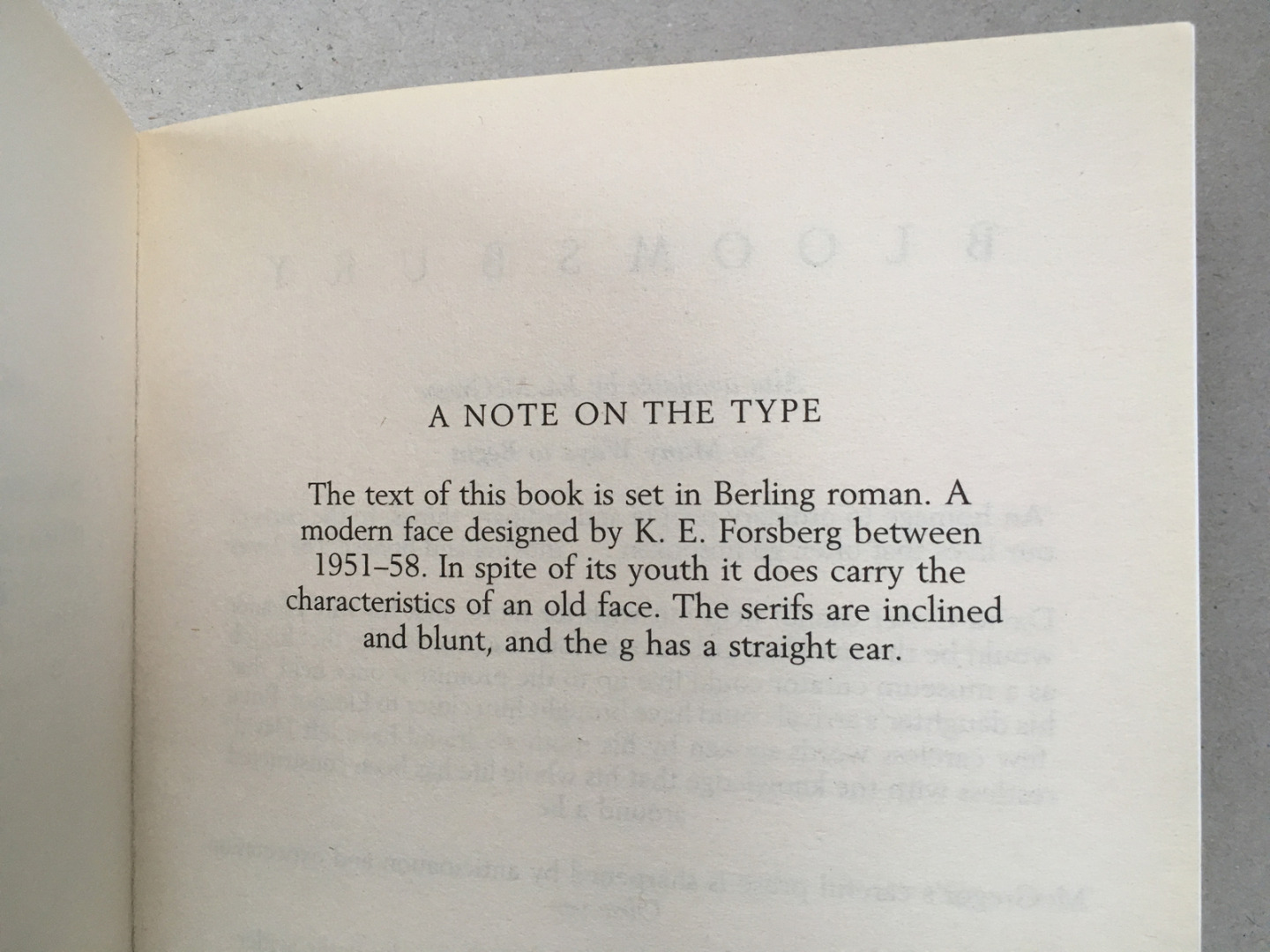
Sometimes the information about the typeface used in a given publication is to be found at the back of the book, increasingly as something of a feature on its own (see Figure 1). Indeed, such has been the proliferation of these ‘notes on the type’, that they have become a focus for pastiche, targeted by both the Paris Review (Russell, 1981) and the New Yorker (McCall, 1997), and even informing a fiction of their own in Jonathan Safran Foer’s ‘About the typefaces not used in this edition’ (2007). However, there is more to the inclusion of these small notes of typographic commentary in our mass-produced books than their comedic potential might suggest and an examination of the origins of this practice alerts us to potential significations beyond the immediate note to which our attention is called.
It is a practice that has been attributed to the working collaboration between the publisher Alfred A Knopf and the designer William A Dwiggins established in the USA during the second quarter of the twentieth century. The typographic historian Paul Shaw (2016) traces the first example of the dedicated typographic colophon to the 1927 Knopf publication of Willa Cather’s Death comes to the Archbishop. He (Shaw, 1984, p 30) notes that, ‘The colophon, headed “A note on the Type in Which this Book is Set,” was a device adapted at Dwiggins’s instigation from private press books, as a means of calling the reading public’s attention to a book’s design and manufacturing background. Initially ridiculed by other trade publishers as an affectation, it has since been copied to varying degrees by many of them.’
A hidden story of ‘making’
https://dx.doi.org/10.15180/191211/003Dwiggins was a student of the eminent American typographer Frederic Goudy and, as Alexander Starre argues (2016, p 77), it is the writings of Goudy that offer a rationale for Dwiggins’s concerns that all aspects of the making of a book should be taken into consideration in its appreciation, even the choice of typeface. It is an argument located in the Arts and Crafts ideal of the book beautiful, which Goudy subscribed to and set out in his own words (Goudy, 1940/1977, p 161) as, ‘A living and corporate entity in which each part is exquisite, conceived harmoniously, with true regard for the intrinsic requirements of the work seen as a whole’.
The Arts and Crafts movement had sought to shift nineteenth-century British manufacturing values away from purely quantitative concerns in an attempt to re-establish more qualitative concerns with how things were made. The book as a made-object was a particular site of contention in relation to the viability of ideals of beauty in relation to the demands of industrial trade production. William Morris set out a case for ‘The ideal book’ (1893) and the work of his own Kelmscott Press, which as Megan Benton argues, ‘was as much about the morality of labour as about the beauty of the printed book’ (2000, p 60). As she outlines, such concerns with reforming the ideals of workmanship migrated to America, but were there tempered by a more positive attitude to the mass market in publishing. Yet, while Goudy and Dwiggins may have approached the commercial potential of the new industrial printing technologies with greater pragmatism than perhaps their British predecessors, their appreciation for the book was still underpinned by an ideology of beauty. Further, and as Starre argues (2016, p 77), ‘in calling the book a “living and corporate entity,” Goudy expressly subscribes to poetological ideals of the organic nature of a work’ and ‘thus strategically latches on to Romanticist aesthetics and its celebration of organic unity as expressed in the works of Goethe, Schlegel, Coleridge, and Emerson’.
While aesthetic ideals change, this Romanticist idea of celebrating the organic unity of the book as a work, and the inclusion of a note which attaches significance to the seemingly smallest acts of its making, has an ongoing resonance. In the face of anticipated competition from digital reading devices the form of the book has arguably (Preston, 2017) become exaggeratedly more bookish with ever more emphasis on those aspects of object-centred design unique to making. As Knopf and Dwiggins before them, so contemporary publishers continue to borrow the visual languages of fine print production for the mainstream in an attempt to educate the public in optimum grace in format, and in better appreciating the book as an object of desire. As a critic from The Spectator observes (Colville, 2016) of the accompanying typographical notes, ‘you’re being reassured that what you possess is a luxury good. Instead of thinking about Word documents and typesetting software, you’re meant to imagine a master typographer, running his fingers across the metal letters until he comes across the perfect fit […] It’s telling that the more digital society has become, the longer and fruitier the typography notes have got.’
Exaggerating the acts of making a book can be seen as a response to a growing maker-illiteracy among consumers. Within contemporary publishing contexts the essential invisibility of the acts of book design can be a problem in terms of an undervaluing of the collaborative and skilled practices involved. As ceramicist Laura Potter has recognised (Potter, 2015), ‘Consumers need to understand an object’s context of production, it’s embedded skills and knowledge and the quality of the materials – its complexity – so that they can develop an understanding of how and why similar things may be differently valued… The digital playing field can make life appear more level than it really is.’
For typographic practice the issue of professional visibility is especially problematic, with the ‘invisibility’ of typography to the end-user often characterised as an essential feature of successful execution.[3] Following this argument, the aforementioned critic from The Spectator (Colville, 2016) complains that the practice of crediting the typeface used in a book is self-defeating, arguing that, ‘when it comes to books, the job of a font (apart from being legible) is to be invisible […] rhapsodising about the font you’ve just read hundreds of pages of is like a magician boasting about how he did his tricks. It calls attention to the illusion — and in the process shatters it.’
Yet, surely we can be wholly captivated while reading an author’s text, and afterwards still acknowledge the contributions of all those others who have worked on the mechanism of its physical delivery to us? A small note drawing attention to the fact that a typeface has been considered at all, let alone chosen very specifically for a given book is a part of exactly the kind of necessary maker-storytelling that Potter calls for and it serves to celebrate one of the many actions that underscore the static and printed text.
The affective contribution of typefaces as archival technologies
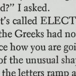
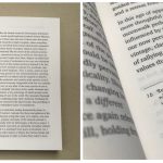
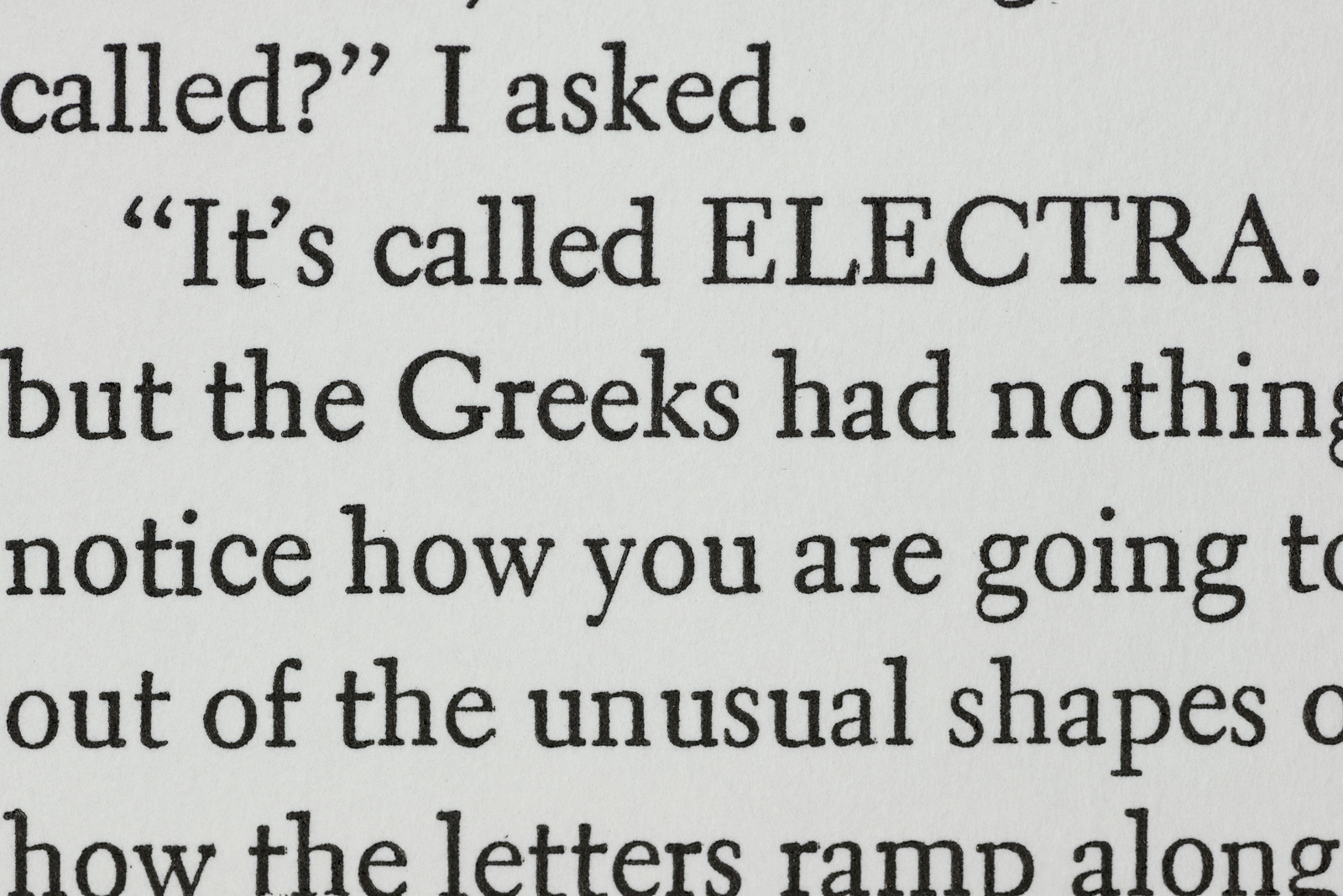
https://dx.doi.org/10.15180/191211/004In addition to acknowledging the act of selection itself, a note on the typeface for a given book may offer a rationale for the choice and an explanation of the intended contribution to the experience of reading. Starre observes (2016, p 75) of the ‘note on the type’ included in the first hardcover edition of Jennifer Egan’s A visit from the Goon squad as published by Knopf in 2010, that a step is made from factual information-giving to making explicit an assertion ‘that the text’s form is meant to trigger a specific aesthetic effect during the reading process’. The note in the Egan volume first introduces the name of the typeface (see Figure 2) and some classificatory details about the style of the typeface, before then going on to suggest that the formal features of the typeface contribute ‘a feeling of fluidity and power’.[4]
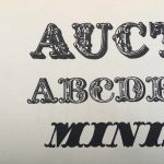
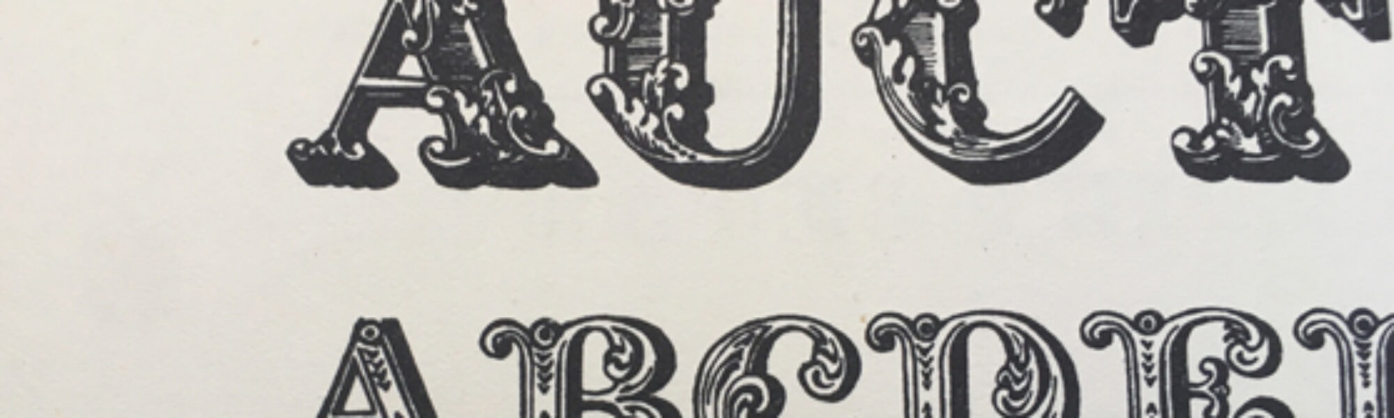
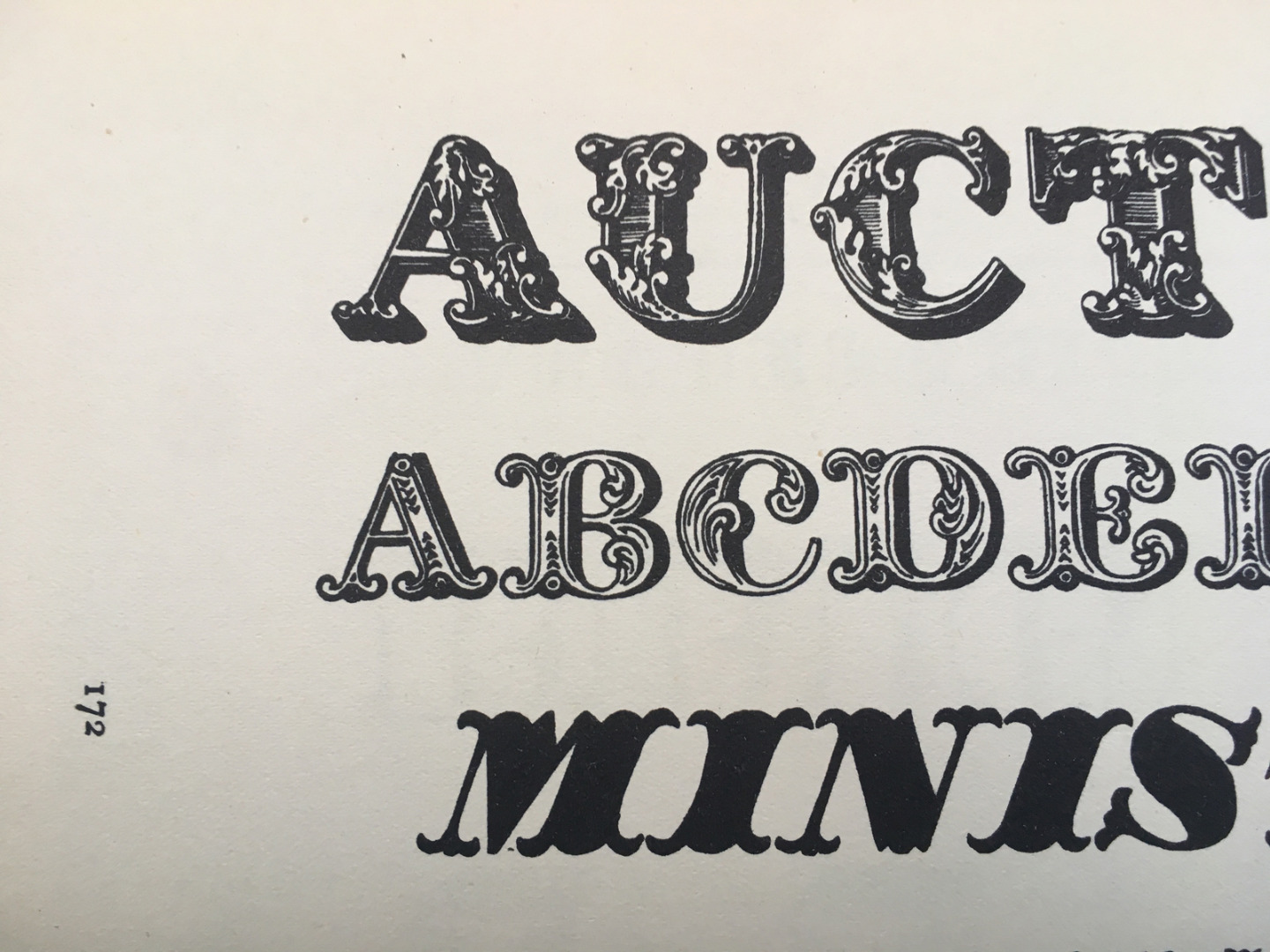
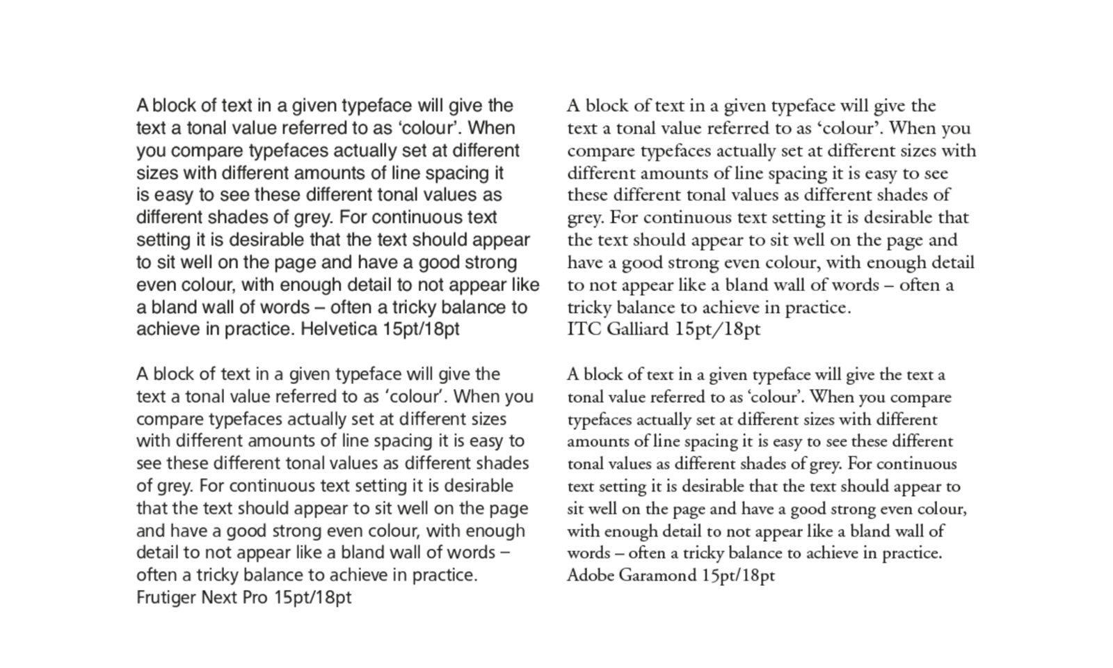
Whether or not a typeface chosen by a designer can in fact trigger a particular set of feelings is open for speculation. The connotative role of typography has been of commercial interest since the early twentieth century, especially in relation to its potential within marketing though, such are the contextual and subjective complexities of its study, definitive outcomes have proven elusive if still attractive. As Paul Luna observes (2018, p xv), the proliferation of digital devices means that we are all now asked to select fonts for our own personal communications, with discussion of the personality-value of typefaces having shifted from the closed-door context of the design conference to daytime television. A positive outcome of this is the opening out of formerly inaccessible specialist territories, so that the difficult-to-surmount barriers between expert knowledge and the ‘reading public’ might constructively be set to one side. However, a less helpful result has been that the selection of a typeface too often becomes a matter of personal opinion rather than informed judgement. If a case is to be made for the emotional contribution of a typeface, it is much easier to argue at the larger display sizes of the more obviously decorative designs (see Figure 3) when the differences between typefaces and our visual associations with them are far more suggestive. It is far less straightforward to determine the connotative contribution of typefaces designed for use at the much smaller sizes used for setting text for continuous reading.[5]
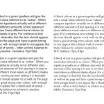
It is true that a typeface makes a very particular contribution to the colour, rhythm and overall texture of the letterform arrangements on the page (see Figure 4). For better or worse. Here ‘colour’ refers to a typographical description of the relative tonal value of the text block.
Each typeface brings a story, too, sometimes explicit and sometimes less so. Embedded within basic roman typefaces used for text typography are the shapes and forms of empire. The stone carved capital letters of Rome and its empire translate almost directly into the uppercase letterforms of the Latin script. As Luna explains (2018, pp 2–3), these refined and careful letters, ‘designed to impress’, combined, ‘legibility with fitness for the technology and they engendered an appropriate emotion’ speaking as they did of ‘authority and purposefulness’ with the Romans using, ‘inscriptions in exactly the way any society uses written propaganda – for purposes of political and social power’. Robin Kinross (1988/2002, p 131) picks up on the socio-political implications of the use of capitals and the dominance of a traditionalist-authoritarian view within orthographic debate underpinned by the fact that these shapes ‘entered into the consciousness of Western cultures as the forms for letters’. Early twentieth century campaigns in Germany challenged such dominance and sought to promote lowercase and the political associations then attributed to it. As Kinross notes (1988/2002, p 139), ‘lowercase was adopted by people who felt that egalitarian principles should extend to letters’ with supporters including writers such as Bertolt Brecht, and later Günter Grass.
Yet, while lowercase has been championed by some in arguments for orthographic democracy, in terms of form, lowercase is itself a product of another empire. Luna (2018, p 4) concisely sets out how, when he explains that, ‘As part of the process of political centralization under Charlemagne (742–814), his scribes sought to impose control through the development of a single style with imperial authority’. The writing style they evolved became known as the Carolingian minuscule, which inspired the later scribes of the Renaissance and helped to establish the basis for the lowercase letter shapes of the Latin script we would recognise today.
Technologies of the past are embedded even in the terms uppercase and lowercase which refer to the stacking of the trays in which metal type was stored. Capital letters, or ‘majuscules’ as they are known in calligraphic terms, were kept in the upper of the two cases, while the smaller or ‘miniscule’ letters were kept in the lowercase. And, of course, the collective description of uppercase and lowercase letter shapes as being representative of the Latin script betrays a further act of embedded colonialization. The universality of the language of what constitutes ‘Design’ being clearly located within the Latin script, which, as the critical collective Decolonising Design (2018, p 79) rightly challenge, ‘renders everything else as Non-Latin because it is not part of the canon’.
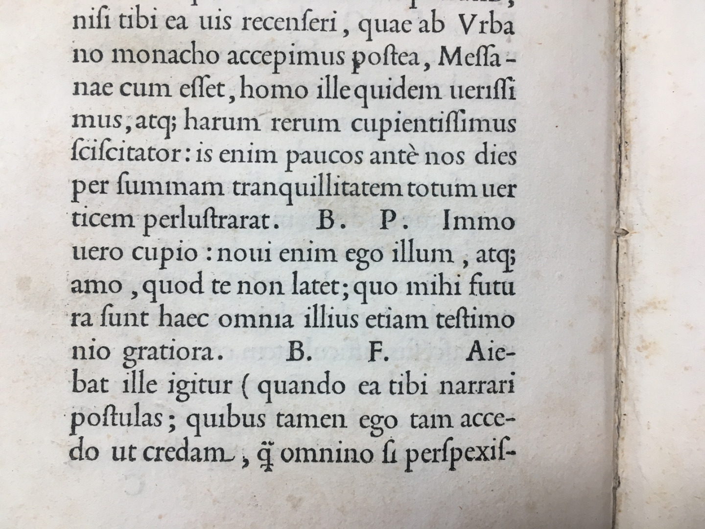
These distinct histories of uppercase and lowercase come together in the humanist manuscripts and Renaissance models for the early roman typefaces of the fifteenth century (see Figure 5), many of which are still available in the form of digital revivals and their subsequent interpretations. For example, the typeface Adobe Minion is closely informed by Renaissance printing sources over five hundred years old but is familiar to many as one of the basic install fonts for Adobe’s creative applications. Calisto MT offers a similar, if broader, set of historical formal ideas and has shipped with the Windows operating system for over twenty years. These types now exist alongside the multiple successors and text typefaces the early Latin printing models gave rise to, imbued with Baroque spiritedness or Enlightenment ideals or whatever has since followed. To look at a contemporary font menu or catalogue is to confront the archival nature of fonts as technology, with every era packed in and so very many formal stories to choose from.
Fonts of technological romance
https://dx.doi.org/10.15180/191211/005Tasked as a book designer with the selection of typefaces for Paul O’Kane’s Technologies of Romance: Part II (2018), I selected two typefaces for the project both for the formal stories they brought, and which aligned to the ideas explored in the book, but also their pragmatic fit to the print tasks in hand (see Figure 6): ITC Charter for the main text and chapter titles and Metallophile Sp8 for the footnotes, folios and running heads.
Charter is an original design created by Matthew Carter (of Georgia and Verdana fame) for Bitstream, the first digital type foundry established in 1981. Carter began work on Charter in 1985 for use in early digital newspaper typesetting. At that time printer memory was limited, so attempts were made to produce typefaces which would economise on font data. Curves are more data-heavy than straight lines, and so in Charter any non-essential curves are replaced by straight lines (see Figure 7) resulting in simplified wedge-like serifs and the use of facetted shapes, introducing a particular crispness to character forms. By the time the typeface was released in 1987 printer memory had increased and the problem Charter was specifically designed to overcome no longer existed. Carter himself now regularly warns in his lectures of the folly of trying to design a typeface for a specific technology or issue, given the seeming redundancy of his own efforts even before it was released.
Yet, Charter represents anything but a dead technological end, rather a continuum in a narrative of formal response to change. The underlying model for Charter is one of Pierre Simon Fournier’s defining roman types of mid-eighteenth-century French typography. Fournier’s model represents a threshold moment in typographical history, as the tastes and practices of the past made way for the influence of new tools and new approaches. Anchored in history, the typeface Charter offered technological insights into these various pasts, as well as a tool well-suited to digital software interfaces and printed contexts.
Metallophile SP8 from Mark Simonsen offers a digital glimpse into the rendering characteristic of a bygone era of mechanical typesetting. The geometric shapes of the typeface Futura designed by Paul Renner in the late 1920s are notoriously severe, the sharpness of which is only exaggerated by the uniform precision of modern digital renditions. Futura was originally published by the Bauer foundry in an era of production when fonts were cast in metal at particular sizes. The basic design of a typeface was optically adjusted for the different sizes at which fonts were cast in order to optimise presentation and performance. Such nuances of form between different sizes of a typeface could not be replicated in early digital systems, and are not easily accommodated even now. Yet these optical allowances of the original cast Futura fonts combined with the inky process of transfer from metal type to paper would have varied and softened the sharpness of the typeface design in its actual delivery. Simonsen (2019) characterises such variation as ‘warmth’ in contrast to the ‘coldly precise’ contemporary digital renderings of the type. And noting this space in between design and delivery he created Metallophile SP8 as a facsimile of 8 point (approximately 2.822mm) Futura but as it would have looked on a letterpress printed page, with all the variability of actual printed forms. It is used in Technologies of Romance: Part II just a little larger than the optimum 8pt model that inspired the typeface.
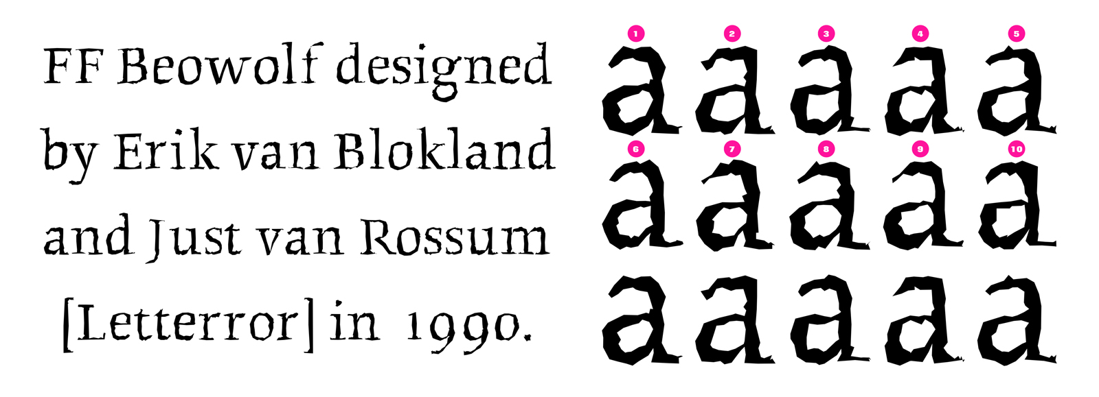
Unsurprisingly Simonsen isn’t the first designer to have tried to capture the spirit of earlier technologies using digital means. Zuzana Licko (Emigré, 2019) drew parallels between the facetted forms of her 1990 digital typeface journal and the informal and irregular qualities of letterpress printing. However, that same year Dutch design partnership LettError created the typeface Beowolf, which explored in a wholly new way the variability of shapes that resulted from letterpress printing as a mechanism for enlivening the predictable perfection of digital typeface output. The Beowolf font made use of a piece of code, which is located within the communication between computer and printer. As the computer sent the outline data of a given character to be printed, so the code randomised that outline data and so every character printed differently each time it was used. The data could be randomised – a little, or a lot – with monstrous results: though the typeface takes the name (if not the spelling) of the eponymous hero of the Old English epic poem and not the monster he defeats.
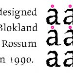
It is a typeface which really couldn’t have been generated in any previous technology but truly explored the potential of the digital. Ironically, as technologies have ‘advanced’ so the elements that allowed for the randomising of outlines in the original Beowolf font ceased to function. Now a rather tamed version of Beowolf alternates between only ten possible permutations of each character (see Figure 8), drawing from nearly ninety thousand glyphs created by an army of purpose-built bots. Immense and still with a ‘Faustian’ intent for mayhem, the typeface no longer roams the infinite variability of form it had to explore previously (Fontshop, 2019). And the romance is lost.
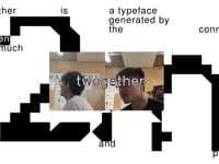
Yet, maybe not completely. In the Summer of 2018 two graduating students from Central Saint Martins, Benjamin Chan and Malone Chen (TwoMuch, 2019), showcased their typeface Twogether, which reflects their observation that they work better when they are together. Data-driven but with a concern for finding the human within the technology, the Twogether typeface is glitchy until their geo-data prompts tell the font that they are next to each other (see Video 1). And then it works perfectly. A typeface for two – a new Romantic development for typeface design.
Conclusion
https://dx.doi.org/10.15180/191211/006The choice of typeface for a book might seem unimportant. A minor decision in among all the very many decisions that are made in the process of communicating the information intended for its pages. Yet, as this text starts to unpack, the choice of a typeface and the particular act of noting that choice in print play out in more significant ways than might first be apparent. That a decision has been made at all starts to reveal the very nature of the book itself as a technology, and allows for some reflection on the values of ‘making’ books within both historical and contemporary contexts of production. In addition to reinforcing narratives of making in relation to the book, it demonstrates the intimacy (we might metaphorically say ‘romance’) in the relationship of the book with typography and typeface design and the foregrounding of this relationship in such decisions. As such, the ‘affective’ qualities of typeface design are given a central place within the broader realm of technologies of book production, past and present, with the act of offering a rationale for why a given typeface has been selected opening out an opportunity to consider typefaces themselves as technologies, both archival and Romantic.
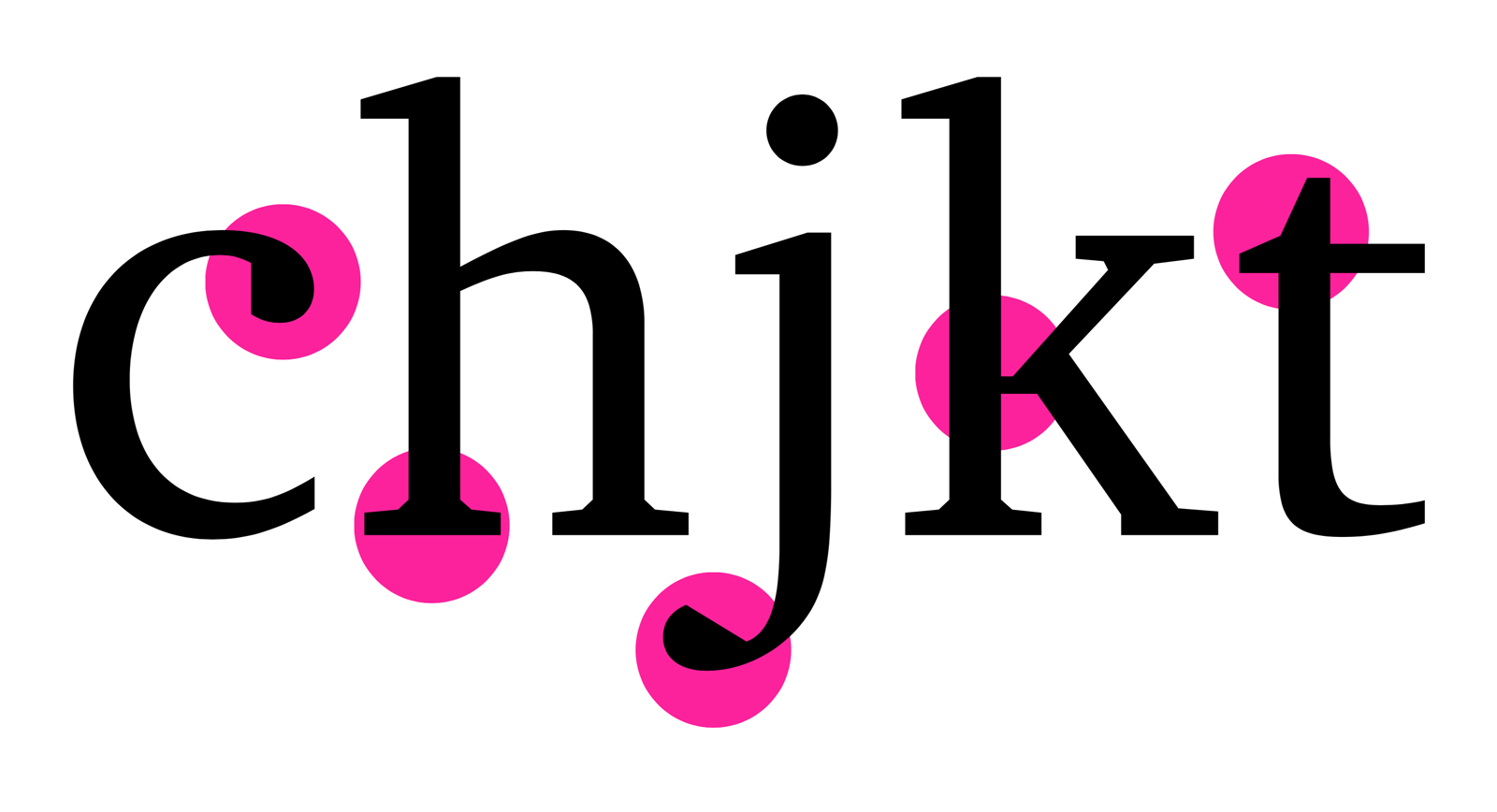
Typefaces are selected for both functional and emotional reasons. Matthew Carter’s Charter typeface illustrates, for example, a functional design response to the given restriction of the limited memory capacity of early digital printers. Furthermore, detailed consideration of its particular forms could usefully explore the internal proportional relationships between uppercase and lowercase letterforms and points of differentiation articulated by the typeface designer between the relative heights of particular parts of the letters, for example, the relative heights of the capital letters to the lowercase letters with ascenders such as b, d, f, h. Such points of differentiation have been shown to enhance the legibility of characters, especially when used in wayfinding contexts. And the detailed decisions informing a typeface’s appearance in print also reveal particular aesthetic agendas, which may be directed towards prompting an emotional response from the user/reader. The softening of hard edges in typeface design, for example, is a feature regularly marketed as ‘friendly’.
The use of a given typeface in a book might also be far more arbitrarily determined by the font menu of a given system of proprietary typesetting technology or a shared font library. This journal is set in the typeface Calibri which was designed by Lucas de Groot for Microsoft and first shipped with both Windows Vista and Office 2007 and which has been part of Windows ever since. As one of the six typefaces which comprise the Microsoft ClearType font collection, it was designed to work with enhanced subpixel rendering technologies to improve the appearance of text on particular screens. Its pragmatic design and accessibility make it an almost inevitable choice for PC users working on a collaborative editorial project such as an online journal. While arbitrary or seemingly inevitable, as the archival nature of this consideration of typefaces as technologies starts to explore, the use of a given typeface is never neutral. Rather the typefaces selected are embedded with a multi-layered set of possible meanings from the forms of the imperial letters they manifest, and the associative terms we use to describe them, to the details of each individual pattern of shapes determining a particular typeface’s design.
In their archival capability typefaces, and especially those described as ‘revivals’ – such as contemporary versions of the eighteenth and early nineteenth century book types of Baskerville or Bodoni – capture too the romance of our bookish past as well as our bookish present. As personal testimony permits it is not impossible to use even Beowolf for a book, though it takes some time to print proof layouts. Yet, even then Beowolf fulfilled its brief of revisiting the process of letterpress using digital means, eschewing the speed associated with new technologies and rather echoing the slowness of hand-setting. The subsequent development of responsive typeface technologies, so-called ‘variable fonts’ and experimental projects such as the Twogether font perhaps move us beyond books altogether, at least as framed by our current understanding of the technology of the book. In so doing they allow us to start to consider the possibilities for what our information futures might look like and the typefaces they might yet be set in.
Tags
Footnotes
Back to text
Back to text
Back to text
Back to text
Back to text
References
Author

Media in article